DASHBOARD
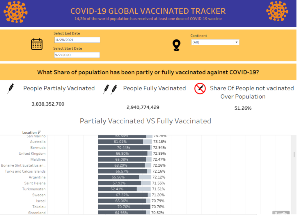
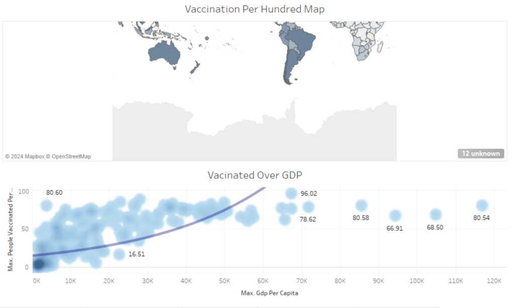
The dashboard below is an example focusing on people partially vaccinated, people fully vaccinated, people not vaccinated, and GDP. Usually, the first page of a dashboard contains the most important KPIs. You can navigate through the dashboard using the menu at the top. You can change the time and continent you want to know the vaccine spread.
GOALS
The purpose of a dashboard is to view the most important KPI’s and results at a glance. Dashboards are an interactive way to see how vaccines are distributed around the world
RESULT
Using this dashboard you will easily find how the first and second stages of the vaccine were distributed, and the effect of GDP on vaccine distribution. In addition, you can also see the distribution of vaccines over time.
PROJECT DURATION
On average, the development of a dashboard takes 2 weeks – 1 months. The development consists of two phases:
- Selection of KPI’s and design of the dashboard
- Collecting data and dashboard development
If you enjoyed this post on COVID-19 dashboard, feel free to get in touch with me (Febrian Nur Alam) regarding any thoughts or queries!